Personal branding · Identity system
Building recognition through a complete visual language.
A personal identity designed to feel credible, approachable, and unmistakably mine.
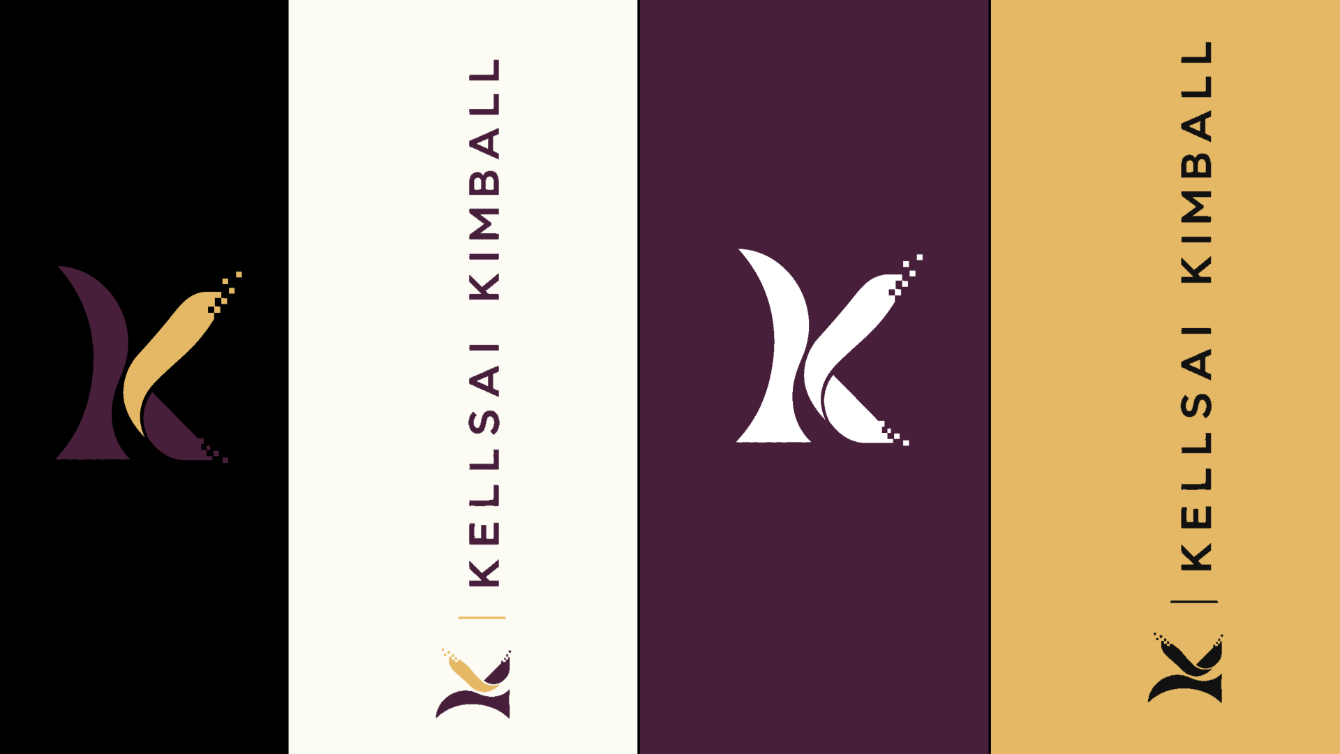
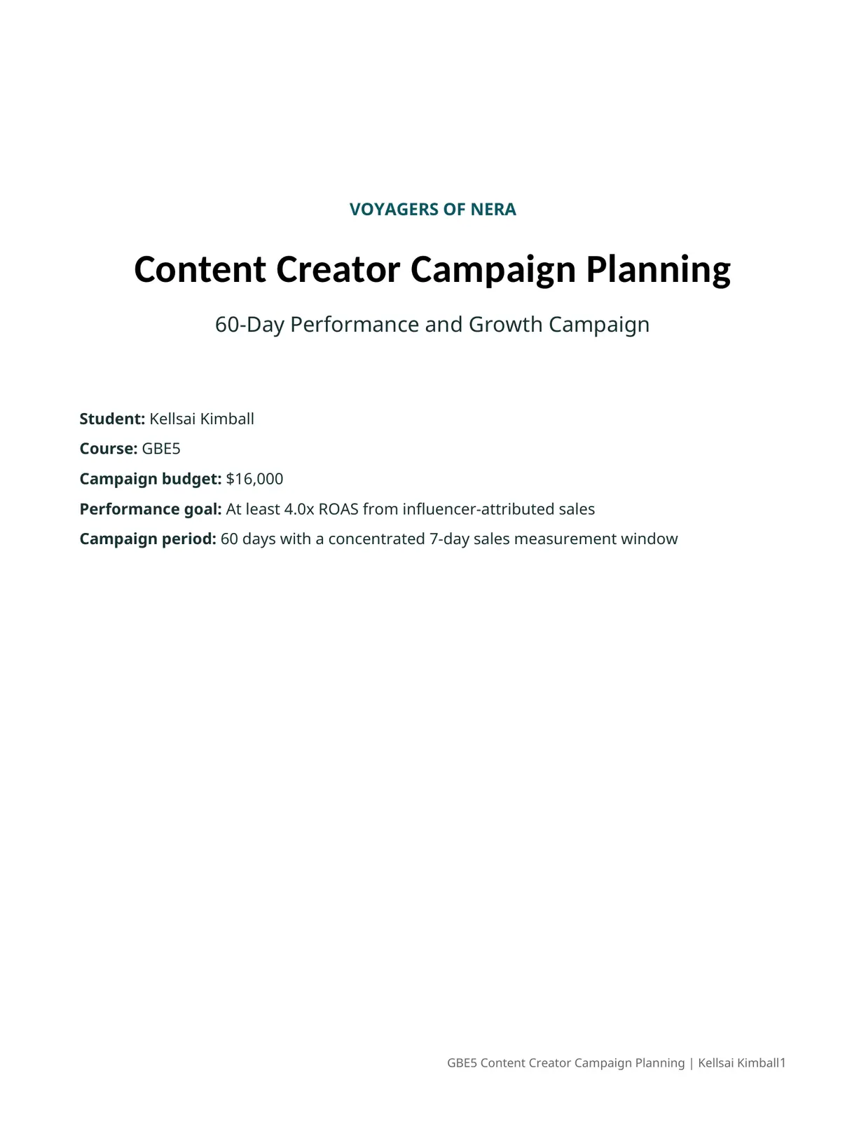
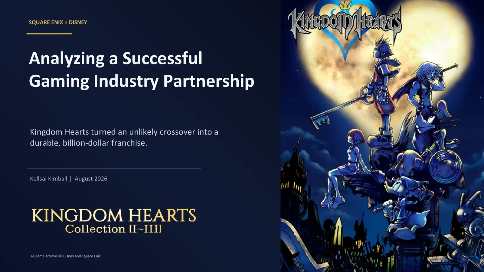
Branding is more than a logo. It is the system that makes every interaction feel connected. I developed a flexible mark, purposeful color palette, clear type hierarchy, and repeatable visual direction that can stay consistent across a résumé, portfolio, presentations, social content, and community materials.
01RecognitionA distinctive K-shaped mark creates a memorable signature across formats.
02ConsistencyDefined color, type, and spacing choices make every touchpoint feel related.
03MeaningDeep plum communicates trust and confidence, while warm gold adds energy, optimism, and approachability.
What it demonstratesIdentity design, visual hierarchy, color psychology, typography, brand personality, system thinking, and the importance of trust-building consistency.
Core identity systemPersonal brand · 2026

Primary markWordmark + monogramThe mirrored curves form a distinctive K while suggesting movement, connection, and forward momentum.
Color systemConfidence balanced with warmth
Plum#471F3B
Gold#E4B865
Charcoal#231F20
Cool gray#C4C4C4
Warm white#FCFBF4
Type hierarchyPersonality first, clarity always
Display · GeorgiaKellsai Kimball
Supporting · Trebuchet MSCOMMUNITY · STRATEGY · CONNECTION